BRINGING COLOR INTO LIFE
 Since the mid-century fever broke out about 70 years ago, mid-century modern design has had a strong presence in interior design.
But the mid-century style is not just about shapes. Color plays an extremely important role. From the cheerful hues of the 1950's to the softer, colours will give your home the perfect combo of mid-century. The colours are a reference to the design era of the 1950's and 60's, but they can also be perfectly suited to today's decor. They make any space fun, lively, cosy, and comfortable.
There are several color palettes widely used in the mid-century, we bring together some of the most popular shades of the time that are increasingly present today.
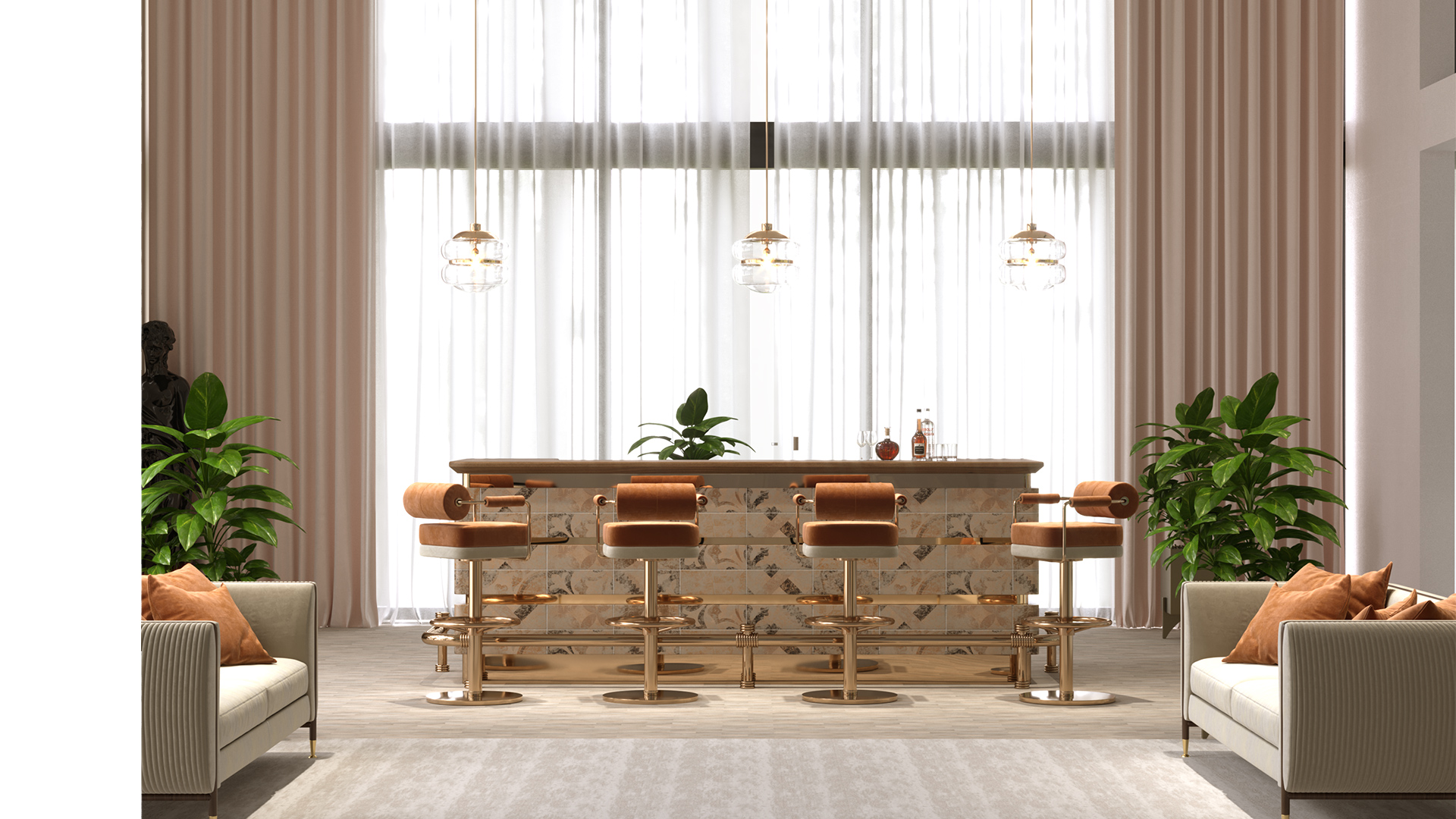
TANGERINE ORANGE
Is the perfect combination of mid-century colours. An orange detail will fit in any room and enhance vitality. Mulligan's design is a light approach to the mid-century style, bringing to any modern bar or kitchen a fresh look. A splash of yellow can help you stimulate your creativity.
And if you are superstitious and believe that orange is the color of success, it is best to bet on the use of this color.
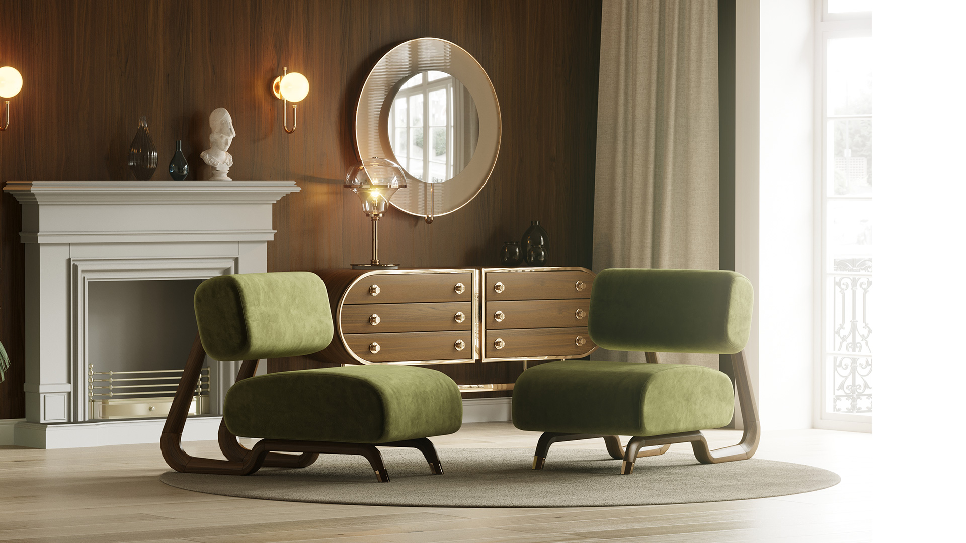
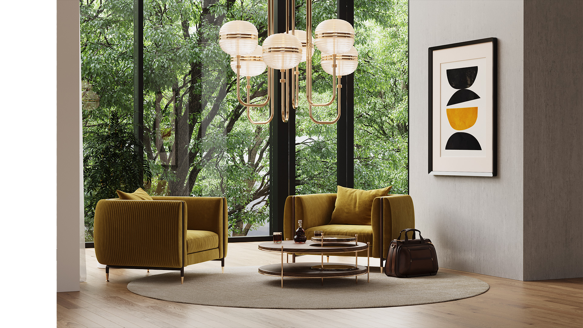
OLIVE GREEN
It gives an air of freshness and lightness, at the same time that it brings mid-century elegance to the decoration.
If you want to create an angle in your room to make it more interesting, it is a good idea to bet on an olive green sofa or armchair, like our Lewis Armchair. And if you want to make olive green even more luxurious, how about combining it with furniture with gold and brass accents? It's a perfect match.
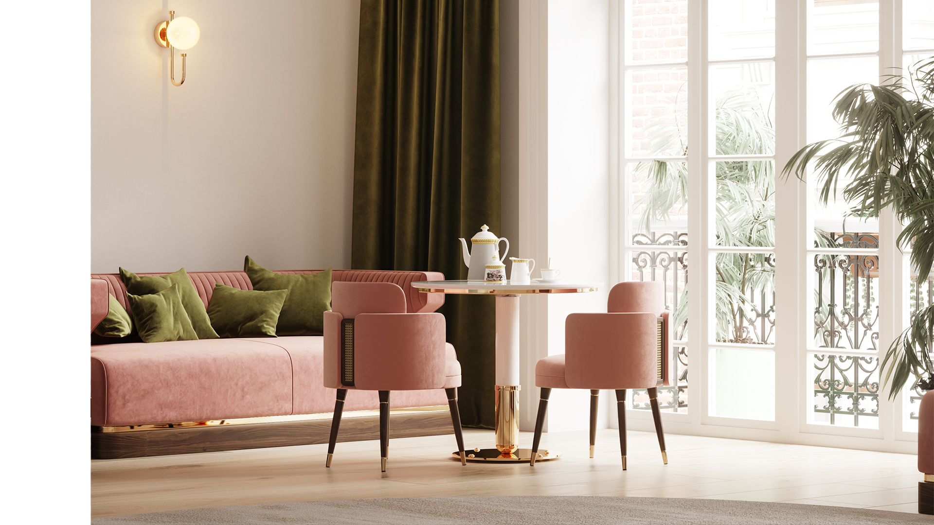
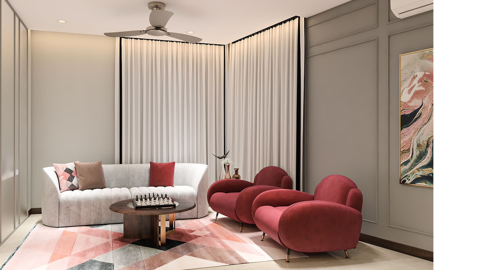
PINK
The must-have for a luxurious interior. The decor in the mid-century era used various shades of pink throughout the house. Tones ranging from pastel to intense pink tend to combine well with neutral tones.
Looking for ideas to add pink to your project? Ammons Sofa intends to give a fresh aura to any design and will take positivity into interior décor. Or you can also choose the Bond Dining Chair. Its main attraction lies in the backrest's design, where the materials combination makes it more appealing.
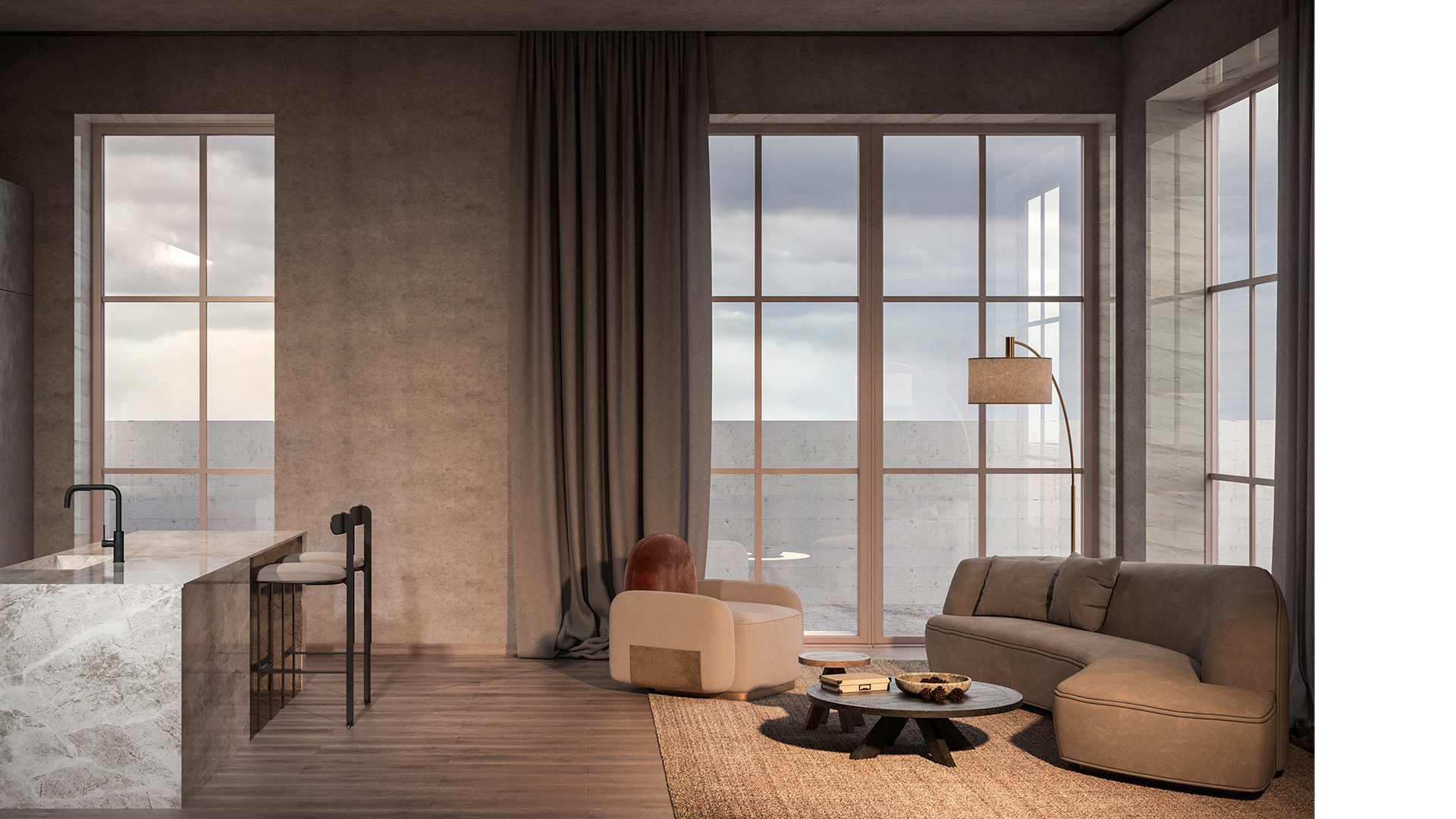
TIN GRAY
Perfect for balancing bright reds, oranges, or yellows, adding a refreshing touch to the hottest colours.
If you want to create a more neutral, more serene environment, gray pewter is always a good option. But don't think that using gray tones is just synonymous with monotony, on the contrary, it gives a touch of elegance and sophistication to projects. Handy Armchair, an elegant and modern armchair is the ideal complement for any mid-century ambiance.
YELLOW
What colour can represent sunshine better than yellow? Deep yellows heat spaces and make them warmer. It combines well with other colours used in the mid-century and gives the right dose of color to each space. Bright closet doors were very popular and often painted in a golden yellow color.
What's your favourite type of yellow? Barlow Armchair fits in every project and will give them a unique touch that no one will resist.
Who said that life can’t be colourful?
Looking for ideas to add pink to your project? Ammons Sofa intends to give a fresh aura to any design and will take positivity into interior décor. Or you can also choose the Bond Dining Chair. Its main attraction lies in the backrest's design, where the materials combination makes it more appealing.
TIN GRAY
Perfect for balancing bright reds, oranges, or yellows, adding a refreshing touch to the hottest colours.
If you want to create a more neutral, more serene environment, gray pewter is always a good option. But don't think that using gray tones is just synonymous with monotony, on the contrary, it gives a touch of elegance and sophistication to projects. Handy Armchair, an elegant and modern armchair is the ideal complement for any mid-century ambiance.
YELLOW
What colour can represent sunshine better than yellow? Deep yellows heat spaces and make them warmer. It combines well with other colours used in the mid-century and gives the right dose of color to each space. Bright closet doors were very popular and often painted in a golden yellow color.
What's your favourite type of yellow? Barlow Armchair fits in every project and will give them a unique touch that no one will resist.
Who said that life can’t be colourful?
If you enjoyed this article, please share
LinkedIn
Twitter
Facebook
Pinterest
Instagram